Optimizing mobile top-up flow for prepaid users
Ooredoo is the fourth largest telecom provider in the MENA region. Over 50M people use it to stay connected with their loved ones. They wanted to optimize their mobile app experience for their Iraqi customers. I delivered a UX audit, a mobile app redesign, and two playbooks.
I conducted a UX audit of the whole mobile app
It provided an overview of the app’s overall shape. To avoid personal bias, I employed Jakob Nielsen’s 10 Usability Heuristics and cognitive walkthrough. The audit revealed dozens of interaction, accessibility, and content issues. I provided recommendations on how to fix them. My report served as the blueprint that guided the team’s redesign.
But one flow stood out (in a bad way)
The prepaid top-up flow, which customers perform about twice a month to recharge their balance, was riddled with major usability errors and missed business opportunities.
Part of the original prepaid top-up flow
I redesigned the flow’s logic
These improvements had the biggest impact on the overall usability.
I split the first two steps
This reduced cognitive load.
Then, I reordered the sequence
This created a more familiar process structure.
Lastly, I added a summary step
This reduced the risk of error and created upsell opportunities.
At first, I reused an existing pattern
While redesigning the postpaid flow, my team had established a “select and confirm” pattern. It focused on keeping users in full control by breaking actions into single steps. By reusing it, I would maintain a consistent experience and reduce development time.
But testing showed that it didn’t fulfill user needs
The postpaid flow benefited from the “select and confirm” pattern because it involved high-stakes decisions, such as committing to a two-year plan. But the prepaid flow, a more popular option on the Iraqi market, is the exact opposite. Customers top up their phones more frequently with smaller amounts. They want to do so quickly — and that's why the task completion time matters.
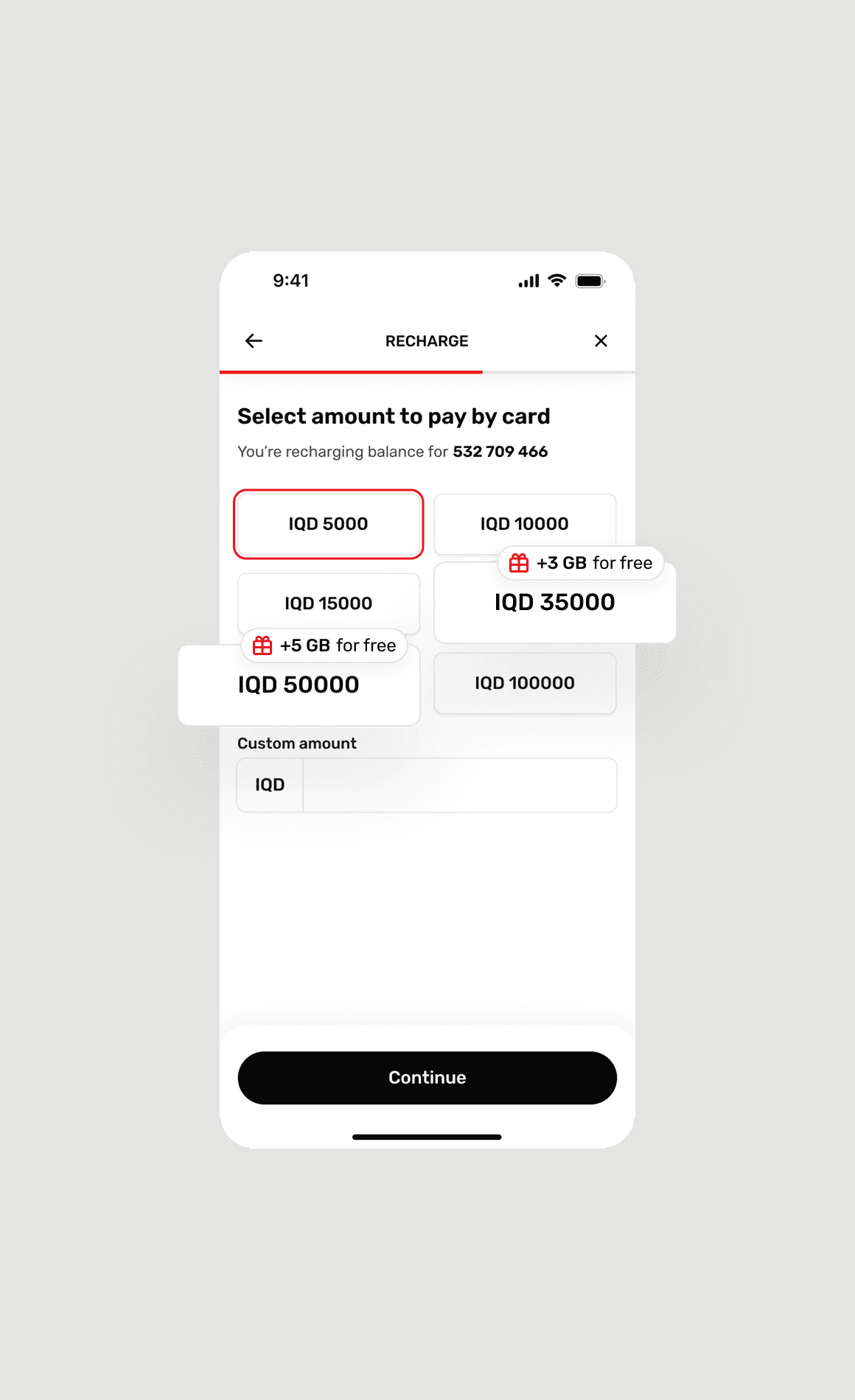
So I introduced a new pattern with 35% fewer taps
It’s suitable for simple, low-risk, and often repeated flows. Users tap their choices and move on. Confirmations are present, but only where necessary.
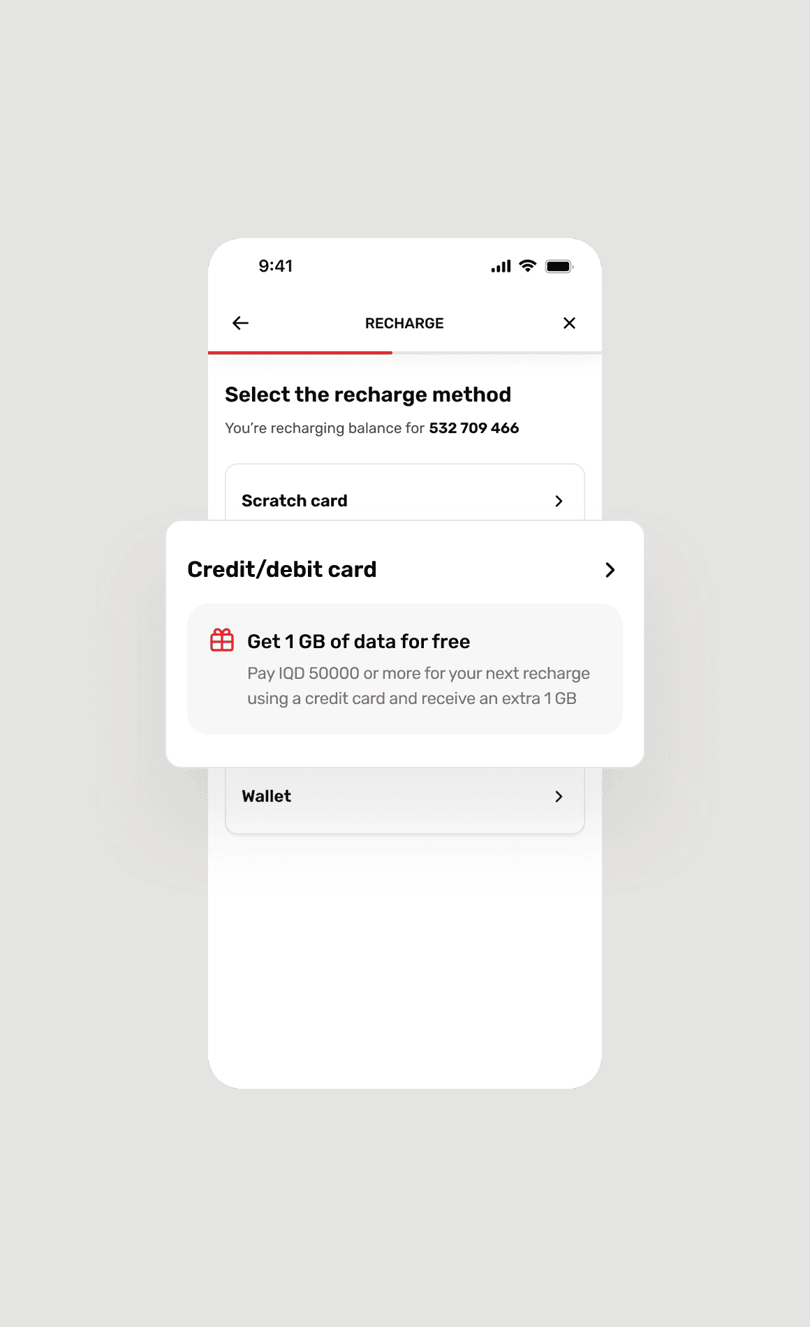
Ooredoo’s business model relied on bundle sales
Customers expected deals to save money and had grown accustomed to them. The upsells had to feel like part of the experience. So I placed them where they’d feel natural and when users were most likely to consider them. This strategy increased the average order value.
And all this time, I was documenting patterns in two playbooks
The goal wasn’t just to fix a broken app. It was to equip Ooredoo with a foundation on which they could build upon. So before the project handoff, I compiled two playbooks.
Core UX patterns and standards
Focused on flow design principles, UX patterns, and accessibility.
Engagement, revenue, and retention strategies
Focused on up/cross-selling strategies, gamification, loyalty programs, and personalization.
Teams at Ooredoo are still using the playbooks for reference
This allows them to apply proven UX and business strategies to apps from other markets.